Cecconi's Miami Beach: Elevating Digital Hospitality
A website redesign for the acclaimed Italian restaurant, transforming their digital presence to match the sophistication of their culinary experience through visual storytelling, streamlined reservations, and strategic social proof.
Cecconi's Miami Beach, 2021
Cecconi's Miami Beach is a critically acclaimed Italian restaurant nestled in the Ground Floor Courtyard of Soho Beach House. Part of the global Soho House family with locations spanning London, Berlin, Barcelona, and Istanbul, the Miami Beach venue needed a digital presence that could match the elegance and warmth of its physical space. My task was to redesign the website to drive reservations while capturing the restaurant's unique atmosphere.
The Challenge
The existing website suffered from a disconnect between the restaurant's refined dining experience and its digital representation. Through analysis of the current site and competitive research, I identified several opportunities:
- Lost atmosphere — The website failed to convey the warmth and sophistication that guests experience in person
- Buried booking flow — The reservation process was hidden, requiring multiple clicks to reach
- Weak social proof — User-generated content and social validation were completely absent
- Information overload — Essential details like location and hours were difficult to find
Design Approach
I approached this redesign with a clear philosophy: the website should feel like a digital extension of the restaurant itself. Every design decision was made to evoke the same feelings a guest would experience walking through the doors—warmth, sophistication, and anticipation.
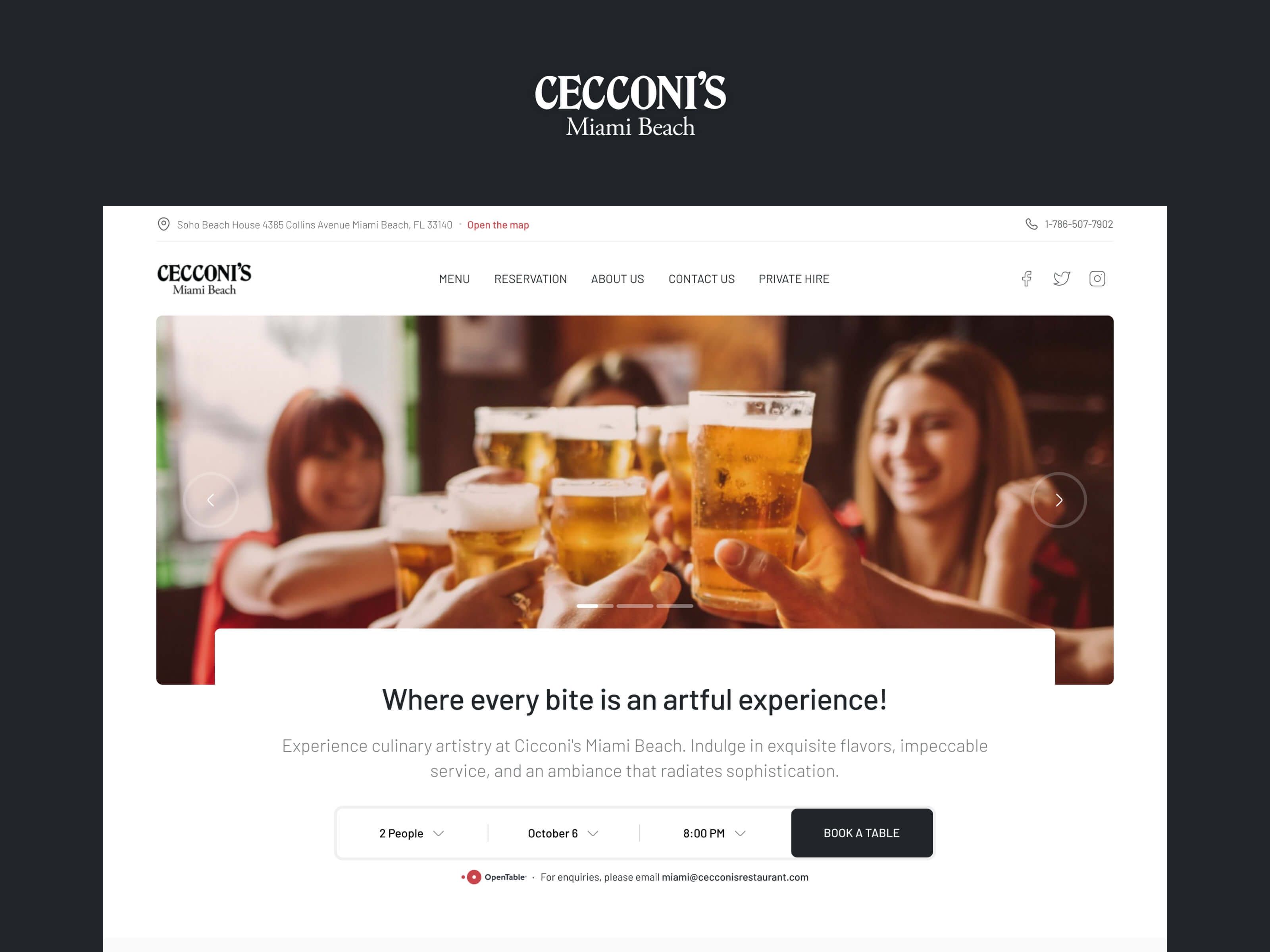
Homepage: Setting the Scene
The redesigned homepage leads with atmospheric photography that immediately transports visitors into the dining experience. Rather than static food shots, I chose imagery of people enjoying moments together—clinking glasses, sharing plates, laughing. This human-centered approach establishes emotional connection before any text is read.
The reservation widget is embedded directly in the hero section, answering the most common user intent immediately. Party size, date, and time selection are visible without scrolling, with OpenTable integration providing instant confirmation.
Below the fold, a visual menu discovery section invites exploration across categories—Breakfast, All Day, Brunch, Drinks, Dessert, Kids—each represented by appetizing imagery. A personal message from the chef adds authenticity and human touch, while a curated feed of guest moments under #CecconisMoments provides powerful social proof.
Reservation Experience: Friction-Free Booking
The dedicated reservation page was designed around one principle: get guests to "Book a Table" with minimal friction. The two-step flow (Find a Table → Your Details) breaks the process into digestible actions.
Available time slots appear immediately after selecting preferences, giving users instant feedback and control. The sidebar maintains persistent access to essential information—location with an interactive map, phone number, and operating hours—so users never need to hunt for details.
The prominent OpenTable badge serves dual purposes: it signals trust through a recognized booking platform, and it reassures guests that their reservation is secure and confirmed.
About Page: Story and Membership
The About page balances storytelling with practical information. The hero showcases the kitchen in action—an intentional choice that communicates craftsmanship and authenticity. The narrative below traces Cecconi's journey from Venice to Miami Beach, establishing heritage and credibility.
For Soho House members, a dedicated section highlights exclusive benefits: priority booking, 20% discounts, and special events. This not only serves existing members but creates aspiration for non-members, with a clear CTA to apply for membership.
Design System Notes
Typography plays a crucial role in establishing the brand's personality. The Barlow font family provides excellent readability while maintaining a contemporary, sophisticated aesthetic. The color palette keeps content areas clean and bright, with the dark header and footer framing each page in the brand's signature look.
Reflection
Restaurant websites often make the mistake of prioritizing visual flair over function. With Cecconi's, I found the balance: a design that captures the restaurant's soul while ruthlessly optimizing for the primary business goal—filling tables. By embedding the booking flow into every key page, surfacing social proof, and ensuring essential information is always accessible, the redesign transforms casual browsers into confirmed reservations.