Otorento: Simplifying Car Rental in Turkey
A mobile application redesign for Turkey's car rental platform, focusing on streamlining the booking experience through simplified search, smart filtering, and friction-free account management.
Otorento, 2022
Otorento is one of Turkey's leading car rental aggregators, connecting travelers with rental companies across the country. When I joined the project, the existing mobile app was functional but dated—cluttered interfaces, confusing flows, and a registration process that drove users away. My task was to reimagine the entire mobile experience from the ground up.
The Challenge
Through heuristic evaluation and competitive analysis, I identified several critical issues with the existing application:
- Cognitive overload — The home screen bombarded users with options, making it unclear where to start
- Friction-heavy booking — Finding and reserving a car required too many steps and decisions
- Registration wall — Users couldn't do anything meaningful without creating an account first
- Limited feedback — Users often felt lost, unsure if their actions were successful
Design Principles
I approached the redesign with three guiding principles: clarity over complexity, progressive disclosure, and trust through transparency. Every screen was designed to answer one question: "What should the user do next?"
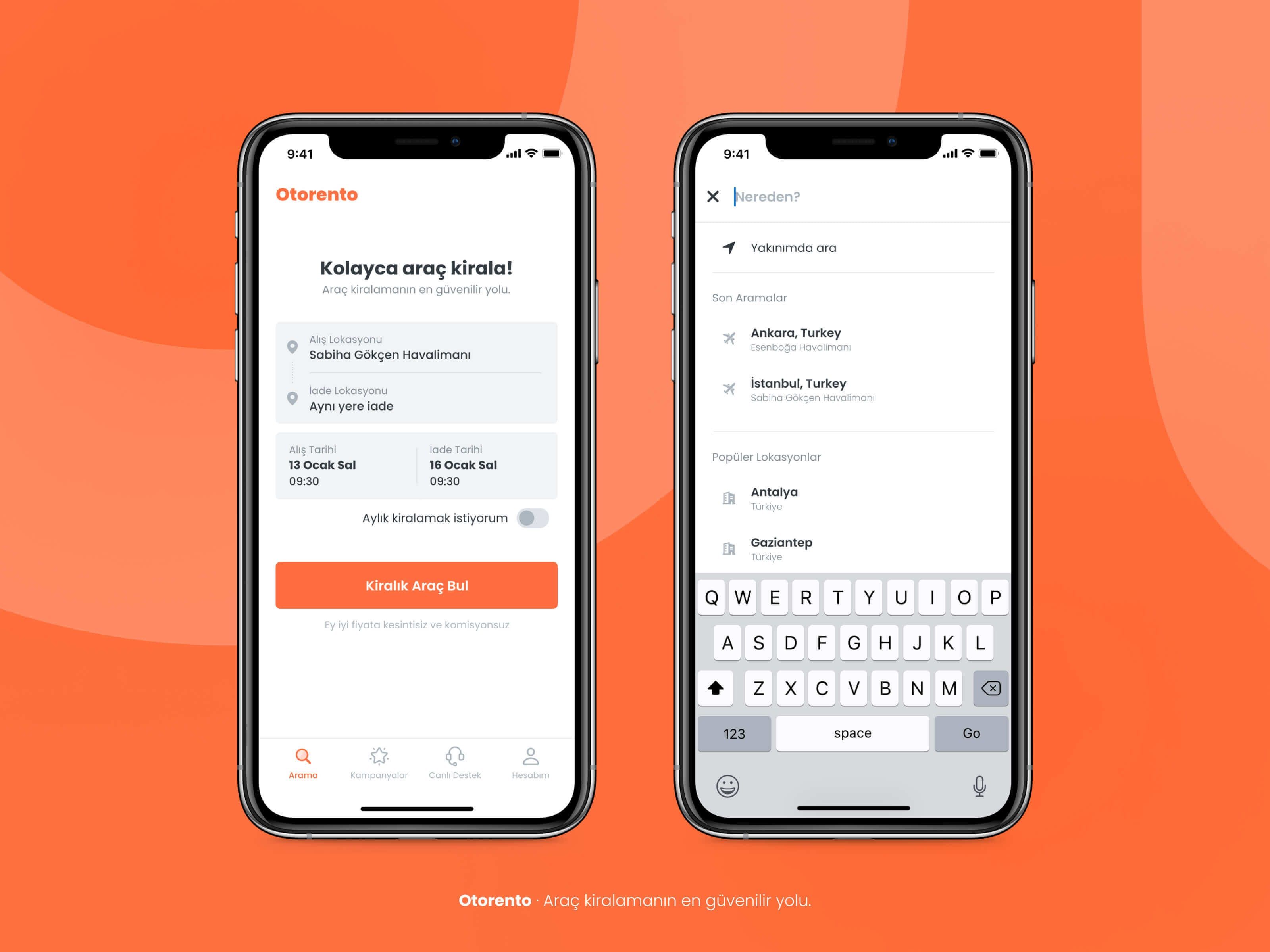
Home & Search Experience
The redesigned home screen puts the core task front and center: finding a car. A clean search card captures pickup location, return location, and dates—nothing more. The bottom navigation provides clear paths to campaigns, support, and account settings without cluttering the primary interface.
Intelligent Location Search
The location search leverages familiar patterns to reduce friction. "Search nearby" uses device GPS for instant results. Recent searches help returning users pick up where they left off. Popular destinations surface common choices for first-time users. As you type, real-time suggestions narrow down options quickly.
Date & Time Selection
The calendar component was designed for clarity. Users can scroll through months continuously, with the selected date range highlighted clearly. A sticky footer shows the complete selection—pickup date, return date, and times—so users always know exactly what they're booking.
Search Results & Vehicle Details
Search results prioritize scanability. Each card shows the essential information: vehicle name, fuel type, transmission, passenger capacity, mileage limit, and daily price. A horizontal filter bar at the top lets users quickly narrow results by transmission type, fuel, or vehicle class without opening a separate filter screen.
Tapping a vehicle reveals detailed specifications in a bottom sheet: age requirements, delivery options, mileage policies, deposit amount, and license requirements. The daily rate and total cost are always visible, building trust through price transparency.
Guest-Friendly Account Access
A key insight from user research: many people abandon rental apps when forced to register before browsing. The redesigned account section allows guests to check existing reservations using just their confirmation number and surname—no login required. This small change significantly reduced bounce rates for returning customers.
Streamlined Registration
When users do choose to register, we made it painless. Phone number verification via SMS eliminates the need for email confirmation and password creation. The entire flow—from entering your number to completing your profile—takes under 60 seconds.
Reflection
The Otorento redesign reinforced an important lesson: in transactional apps, every extra step costs users. By ruthlessly eliminating friction—whether through smarter defaults, progressive disclosure, or guest-friendly features—we created an experience that felt effortless. The result was a cleaner, faster, more trustworthy app that helped users get from "I need a car" to "car booked" with minimal obstacles.